

Case Competition Winner · Project Scoring Tool

ROLE
UX Designer
TIMELINE
8 hours
TEAM
Team Project
Ontario had more data-centre proposals than available electricity. Our team created a Jobs-First scoring system that helps reviewers compare projects by jobs, energy use and community benefit.
01 — Overview
Ontario was facing more data-centre proposals than the electricity system could support at once.
The province needed a fair, clear way to compare projects based on jobs, energy use, sustainability, training and keeping Canadian data in Canada.
My Contribution
I built the interactive prototype in Figma Make, which let us turn the team’s scoring idea into a working experience quickly. I also designed the criteria-ranking visual to show how much each factor affected the final score. My goal was to help reviewers understand what mattered and why some projects ranked higher.
02 — Challenge
The Problem
Ontario could not power every proposed data centre. Approving projects in the order they arrived would ignore differences in jobs, energy use and community benefit.
The Goal
Create a clear way to find the projects that offer the most value without exceeding Ontario’s available electricity.
How might we use limited electricity for the data-centre projects that create the most long-term value for Ontario?
Capacity
Electricity supply could not support every proposed project.
Economic Value
Decision-makers needed to consider jobs, training and broader community benefit.
Responsibility
Projects also needed to demonstrate responsible energy use and Canadian data-storage commitments.
03 — Criteria
Before comparing projects, we needed one set of rules that balanced limited power with long-term value.
Stage 1 — Basic Requirements
First, projects have to qualify
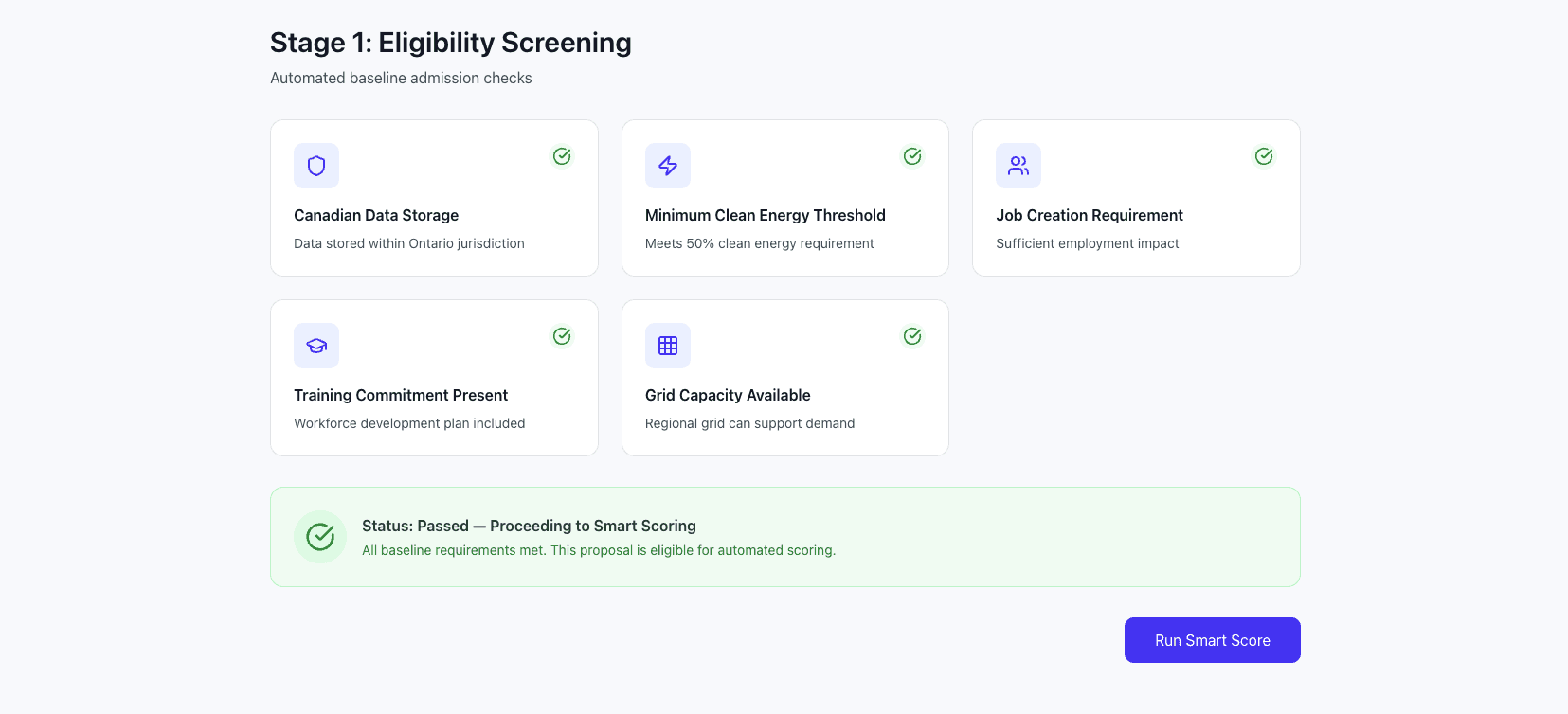
Canadian Data Storage
Data must be stored in Canada and meet Canadian rules.
Ongoing Job Creation
The project must create meaningful, long-term jobs.
Training & Upskilling
The project must support worker training.
Energy Responsibility
The project must use limited electricity responsibly.
Proposal
→
Basic Requirements Check
→
Passes / Does Not Pass

Stage 2 — Scored Comparison
Then, qualifying projects compete on value
04 — Framework
The Jobs-First framework gives every proposal a score, so reviewers can compare projects and still see why each project ranked where it did.
80–100 · Auto-Approve
Strong overall proposal.
65–79 · Manual Review
Promising, but requires additional review.
Below 65 · Reject
Does not meet the minimum score.
A high score cannot ignore serious risks
A high score does not erase major concerns. Reviewers can stop or flag proposals that fail an important requirement.

05 — Prototype flow
Instead of showing judges a spreadsheet, we built a visual prototype in Figma Make. This helped us test and improve the scoring idea quickly.
The interface shows reviewers both the recommendation and the reasons behind it.
Intake
Review proposal information and eligibility requirements.

Stage 1 Results
See whether the project meets the basic requirements.
Credit Dashboard
See the project’s score and how it performed in each area.

Ranked List
The score gives a quick result, while the breakdown explains why.

06 — Decision Flow
Example Ranking
Kingston
88
Auto-Approve
Ottawa
84
Auto-Approve
Windsor
79
Manual Review
London
61
Reject
Design Principles
Comparable
Every proposal uses the same scoring system.
Transparent
Reviewers can understand why a proposal received its score.
Flexible
Human reviewers can still flag risks or request more review.
Jobs-First
Jobs and worker training have the most influence on the score.
Designing for a five-minute pitch
We had five minutes to explain the problem, scoring system and recommendation, followed by three minutes of questions. This pushed us to use clear scores, easy-to-read results and visuals instead of long policy documents.

07 — Outcome
Our team won the case competition with one system that combined basic requirements, scoring and clear visuals to compare data-centre proposals.
The system turns jobs, energy and community factors into a clear recommendation while still showing how it reached that result.
Faster to Interpret
Reviewers can see a proposal’s status and strongest factors at a glance.
Easier to Compare
One scoring system makes projects easier to compare.
Human in the Loop
Human review and risk checks stop the score from making the final decision alone.
My Biggest Takeaway
A good decision tool should not hide complexity. It should organize it. The score mattered, but the reasons behind it mattered just as much.
Try the interactive approval system prototype.
Launch Prototype