

Website Navigation Case Study

Role
Site Structure Designer / UX Researcher
Timeline
Fall 2025
Team
5-person team
A school project about making Fisheries and Oceans Canada’s aquaculture information easier to find. We reviewed the content, asked users to group topics and tested menu paths. The result was a clearer site structure based on what users expected — not government terms.
01 — Overview
People visit the Fisheries and Oceans Canada aquaculture website for very different reasons. Some want to learn about fish farming, while others need licences or technical research.
We checked whether the website was organized the way those users expected.
02 — Problem
The Problem
Important information was buried several menu levels deep. Similar topics appeared in different places, and technical labels made pages hard to predict.
The Goal
Create a clearer site structure using labels and groups that matched how users thought about aquaculture.
How might we organize a complex government website around the way people actually look for information?
03 — Audit
We reviewed the site, its users and their common tasks. We found too many menu levels, repeated topics and inconsistent labels.
4–5 levels
Important information could sit several layers beneath the homepage.
Multiple paths
Similar environmental and regulatory topics appeared in different sections.
Different users
The site had to work for people casually browsing and professionals looking for specific research.

04 — Card Sort
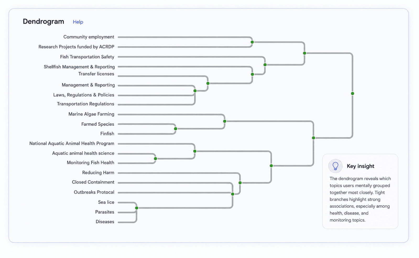
We asked participants to group aquaculture topics in ways that felt natural, without showing them the current menu.
Health
Diseases, parasites, outbreaks and monitoring consistently belonged together.
Regulations
Users grouped licences, transportation and compliance together.
Research
Participants expected research-related information to live in one dedicated area.

05 — Tree Test
We tested the current menu structure against a new version based on the website review and card sort.
Original
Users repeatedly chose a path that sounded right but did not lead to the research information.
Revised
Clearer groups and simpler labels helped most users find the research information.

Tree test A screenshot

Tree test B screenshot
33.3% → 37.5%
The fish-health task improved only slightly. This showed that some health categories still felt too similar, so we adjusted the final structure.
06 — New Site Structure
We combined what we learned into a simpler sitemap with fewer levels and clearer labels.
Aquaculture Basics
Health
Regulations
Research
01 — HOMEPAGE
Shows the four main content areas and gives users clear starting points for common tasks.

→
→
02 — CATEGORY PAGE
Groups related information such as licences, permits, requirements and locations in one clear place.

03 — TOPIC PAGE
Breaks each topic into clear cards and keeps commonly requested information easy to see.

04 — SEARCH RESULTS
Adds filters, short descriptions, page details and a clear location trail so users can narrow results and understand where each page belongs.

07 — Outcome
The proposed site structure uses clearer categories, simpler words and more predictable paths.
Card sorting showed how people grouped information. Tree testing showed that the new structure helped them navigate — especially for the research task, which improved from 0% to 60%.
The biggest lesson was simple: good information architecture isn’t about where an organization thinks content belongs. It’s about where users expect to find it.